Exploring the role of Data Visualization in Data Analysis

Hey there, I am a final-year BCA student living in New Delhi sharing experiences and resources that can help you to succeed or advance in the future.
Data visualization is an important tool for data analysis. It allows us to take large amounts of data and turn it into something that is easy to understand and interpret. This is important for people who work with data, as it helps them to identify patterns and trends that would otherwise be difficult to see.
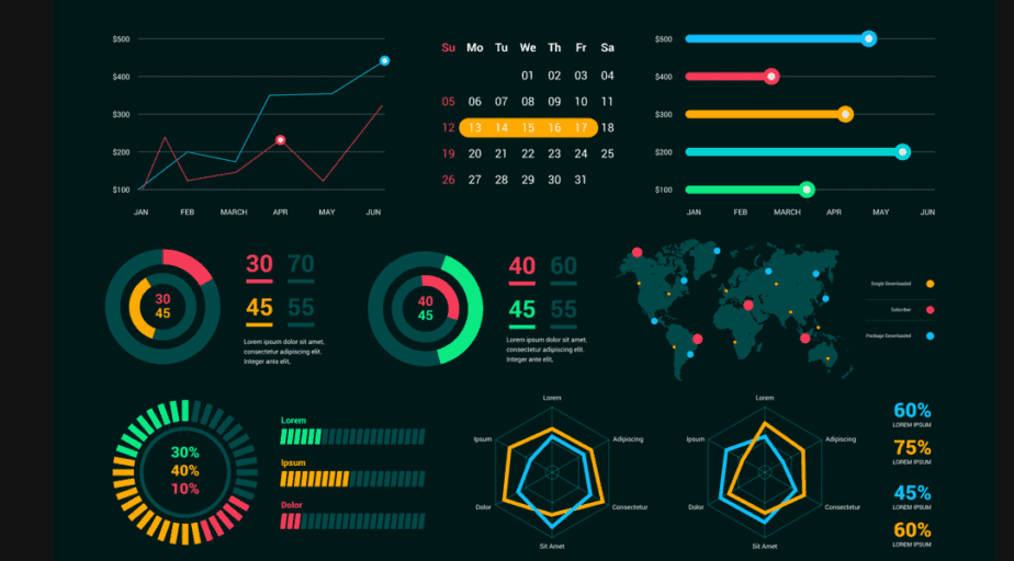
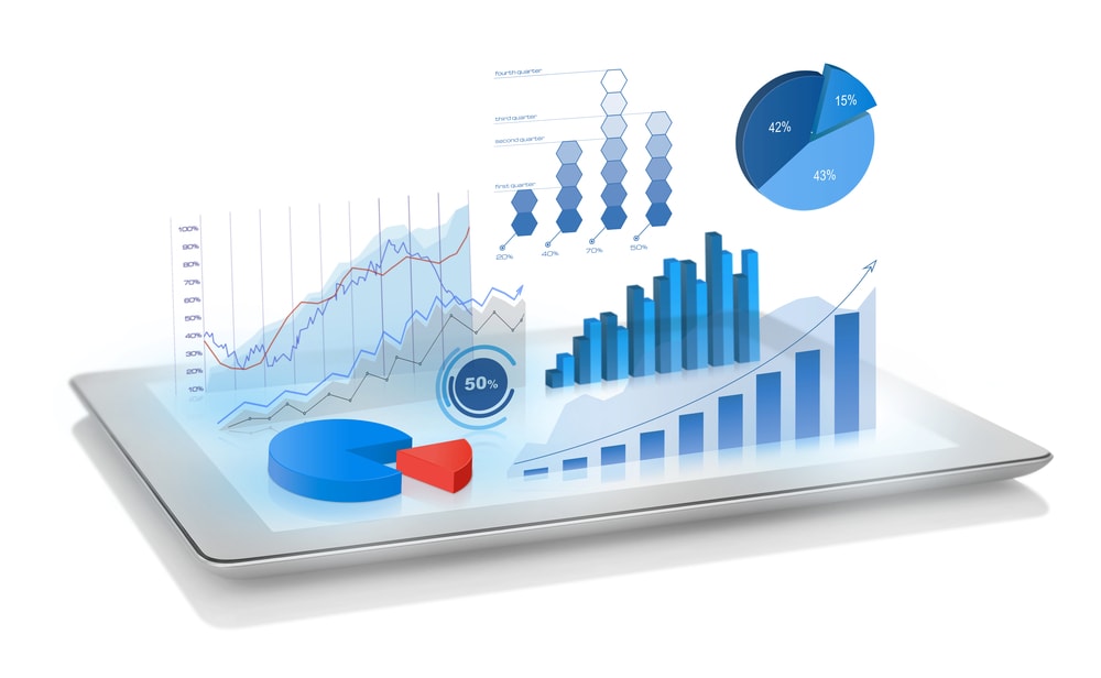
There are many different ways to visualize data. Some of the most common methods include bar charts, line charts, and scatter plots. These methods are great for showing the relationship between different pieces of data and can help to identify patterns and trends.

Another popular method of data visualization is the use of maps. Maps are a great way to show the location of data and can be used to show patterns and trends in different regions. For example, a map of crime rates in a city can help to identify areas where crime is more common, and where it is less common.
In addition to these methods, there are also more advanced methods of data visualization such as heat maps, treemaps and parallel coordinates. These methods are useful for showing the relationship between multiple pieces of data and can help to identify complex patterns and trends.
One of the key benefits of data visualization is that it makes it easier to identify patterns and trends in data. This can be useful for businesses and organizations, as it can help them to make better decisions and to understand their customers better. Additionally, data visualization can be used to communicate data effectively to non-technical people, making it accessible and understandable for a wider range of people.
In conclusion, data visualization is an important tool for data analysis. It allows us to take large amounts of data and turn it into something that is easy to understand and interpret, which can help us to identify patterns and trends. Whether you're a student, a business, or an organization, data visualization can be a valuable tool to help you make better decisions and understand your data better.
Thank you for reading I hope this tutorial has provided a helpful introduction to the role of data visualization in data analysis. Remember the importance of visualizing data to identify patterns and trends, and the various methods such as bar charts, line charts, scatter plots, maps, heat maps, treemaps and parallel coordinates to visualize data. If you have any feedback or suggestions, please don't hesitate to leave a comment. Keep up to date with my latest content by subscribing to my newsletter.


